




Early Development


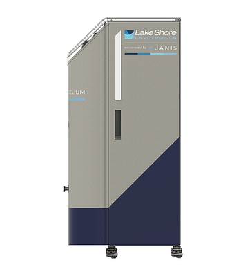
The Infinite Helium system represents a new standard in cryogenic research;
a fully automated, low‑vibration, recirculating helium platform designed for long‑duration experiments below 4 K.
I led the industrial design and user experience development from concept through certification, shaping a product that is both technically rigorous and remarkably simple.


I joined the project at its inception in 2021, developing early concepts that balanced thermodynamic requirements with practical lab workflows.
This phase involved rapid iteration with engineers and PhD scientists to define the system architecture, airflow strategy, vibration isolation approach, and the overall form factor.
My focus was ensuring that every design decision, from internal component layout to external touchpoints, supported reliable sub‑4 K performance while remaining intuitive for users with varying levels of cryogenic experience.
When I joined the project, the early prototype was a tangle of valves and controls that felt more like operating a submarine than a research instrument. The engineering team had boxed themselves into familiar patterns, designing around constraints instead of users. I sat down with them and reframed the process: start with intent, not hardware.
We sketched together, messy and fast on long sheets of butcher paper; and I showed them that early concepts don’t need to be pretty, they just need to explore possibilities. Some engineers admitted they “couldn’t draw,” but once we broke that barrier, ideas flowed. That shift in mindset opened the door to a cleaner architecture, clearer workflows, and a product vision grounded in usability rather than legacy assumptions.


2021
Intern


Link to company website
Development Process


2022
2023
2024
Intern
Intern
Full Time


Features That Matter

The user interface transformed what was once a maze of valves and manual steps into a one‑touch, fully automated control system. I designed the UI to be progressive, offering layered menus that meet users at their level — from expert PhD scientists who want full control to new grad students who just need the essentials. This shift made the system dramatically more accessible, safer, and easier to operate.


The C‑more software, which is older than me, limited the UI to a fixed 480×800 BMP‑only display, so achieving a modern look meant bending the tool far beyond its intended use. I designed everything in Adobe XD and converted the assets through a Python script to make them compatible. The result was a contemporary UI built on top of legacy software constraints.


Simple Controls distills the system into its three primary operating states, each available at a single touch, along with a handful of common maintenance actions. It’s designed as the safest, most approachable entry point for new users, giving grad students and first‑time operators exactly what they need without overwhelming them. This screen embodies the core goal of meeting users where they are.

Advanced Controls builds on the same structure as Simple, but expands it with more specialized options for users who need finer control. It offers deeper functionality without sacrificing clarity, giving intermediate and experienced researchers the ability to tune the system with confidence. This tier bridges everyday operation with more nuanced experimentation.


Manual Mode hands complete control of the system to the user, exposing every valve, component, and routing option directly. Automation is disabled here, allowing high‑level researchers to push boundaries, run edge‑case experiments, and operate the system with full authority. It’s the mode designed for experts who need total freedom and understand the hardware inside and out.
This moment in development marked the moment the design shifted from internal exploration to something we could actually market. They established the visual identity that would shape the final product and set the tone for our first public reveal. A push toward a trade‑show deadline accelerated development more than any internal milestone. We had multiple nights that stretched past 2 a.m. in order to ship the system out in time for the show.


Errors are impossible to miss because the machine lights, UI indicators, and navigation all turn red/orange to pull the user’s attention. The main Error screen explains the fault and how to resolve it, while the Observations tab quietly tracks component data in the background for future troubleshooting. The Event Log records every user action, allowing troubleshooters to distinguish what the system was doing from what it was told to do. Together, these tools create a complete, reliable picture of system behavior that makes diagnosing issues fast and straightforward.


Compliance
The system was engineered to meet CE and NRTL requirements, including tip‑tilt stability for seismic events, RF emission limits, electrical protection, and proper pressure containment. These considerations were integrated throughout development so certification became a confirmation rather than a redesign. The images in this section document the applied compliance markings such as power specifications, fuse ratings, and other technical identifiers.


.png)


Helium Line Vacuum Port

Vacuum Jacket Port

Helium Fill Port

Room Temp
Supply Cold Gas
Supply Cold Liquid
Error - Fault Stay
Error - Fault Off


STATUS INDICATORS ghadfhafaghhhhhh sdhhhhhhhhhs d hhhh ffffffs fffffs sg fffs fffs fffffffs s fffffffg sgsg ff sdf gsg sdg sdgs gsdsgs gs gsagh ghszdfgh ahga gha sgfag Zg asgsdg fsg gfg Dgf SDGSDHG SHJFSFHSHGasfa faf asfafas fasf asf afajs fafga ijfbaifg aisf ghaifhaisf aif aifhbai fha iabfiabsfi abfiabsfi absifba ifbafasf
STATUS INDICATORS
STATUS INDICATORS ghadfhafaghhhhhh sdhhhhhhhhhs d hhhh ffffffs fffffs sg fffs fffs fffffffs s fffffffg sgsg ff sdf gsg sdg sdgs gsdsgs gs gsagh ghszdfgh ahga gha sgfag Zg asgsdg fsg gfg Dgf SDGSDHG SHJFSFHSHG


USER INTERFACE
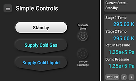


Simple Controls distills the system into its three primary operating states, each available at a single touch, along with a handful of common maintenance actions. It’s designed as the safest, most approachable entry point for new users, giving grad students and first‑time operators exactly what they need without overwhelming them. This screen embodies the core goal of meeting users where they are.

lighting system
mobility (wheels and handles)
full automation (UI/UX (under the hood and automated maintenance)
unwanted interference (RF emissions (lights and shielding) (grad student/unwanted user interference)
component heat management (layout)
Hero Shot
CE and NRTL compliance certification
Manual imagery
revisions and sustaining

.png)
Better image of the ai version of the back panel
4 error images but in orange
manual imagery
lighting system
mobility (handles and wheels)
full automation and under the hood (render of the screen)
unwanted interaction (RF shielding and lid soft lock)
component heat managment
hero shot


